

Brand
Project
Landing Page Directions for AI Document Processing Company
Case Study for Reducto designing three distinct landing page directions — each rejecting the dark, gradient-heavy AI aesthetic in favor of something human and ownable. The Highlighter used a pink marker metaphor and editorial warmth. Pixel Intelligence paired minimal grayscale with pixel art iconography. Purple Elevated used Reducto's existing brand color with real conviction. All three prioritized actual product visibility over decorative animation.
Summary
Tools
Figma, Photoshop, Illustrator
Responsibilities
Art Direction, Brand Design
Project Overview
A brand design exercise exploring three distinct visual identities for an AI document processing platform. The challenge was to move beyond the generic AI SaaS aesthetic — dark modes, gradients, abstract animations — and create something genuinely human, playful, and elevated that would resonate with enterprise knowledge workers while standing apart from every competitor in the space.
The Problem
The document AI category is visually indistinguishable. Every competitor uses the same dark backgrounds, purple gradients, and abstract technical imagery. None of them show the actual product. None of them feel human. The brief called for three genuinely different creative directions — not color variants — that each solved the humanity, paper/digital, and product themes in a distinct way.
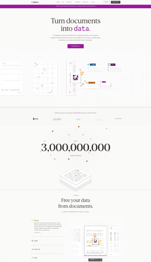
Competitor Landscape
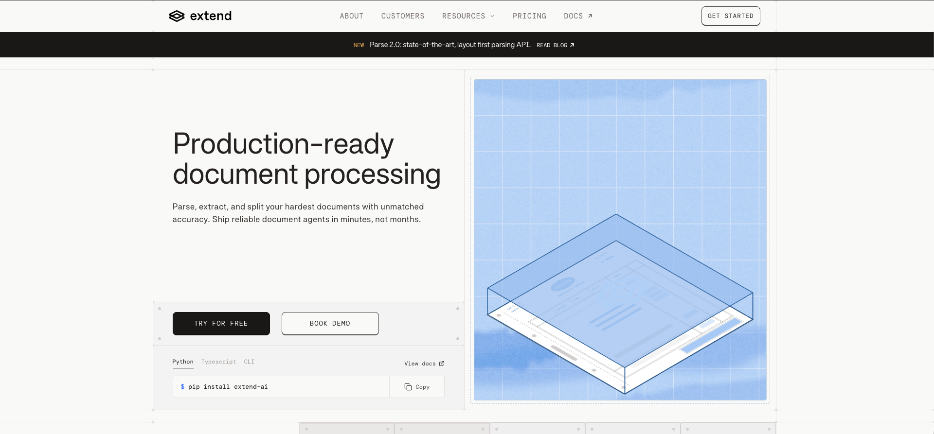
Extend.ai
Most visually polished of the three. Dark mode, developer-first, technically confident — but cold and indistinguishable from the broader AI SaaS aesthetic.
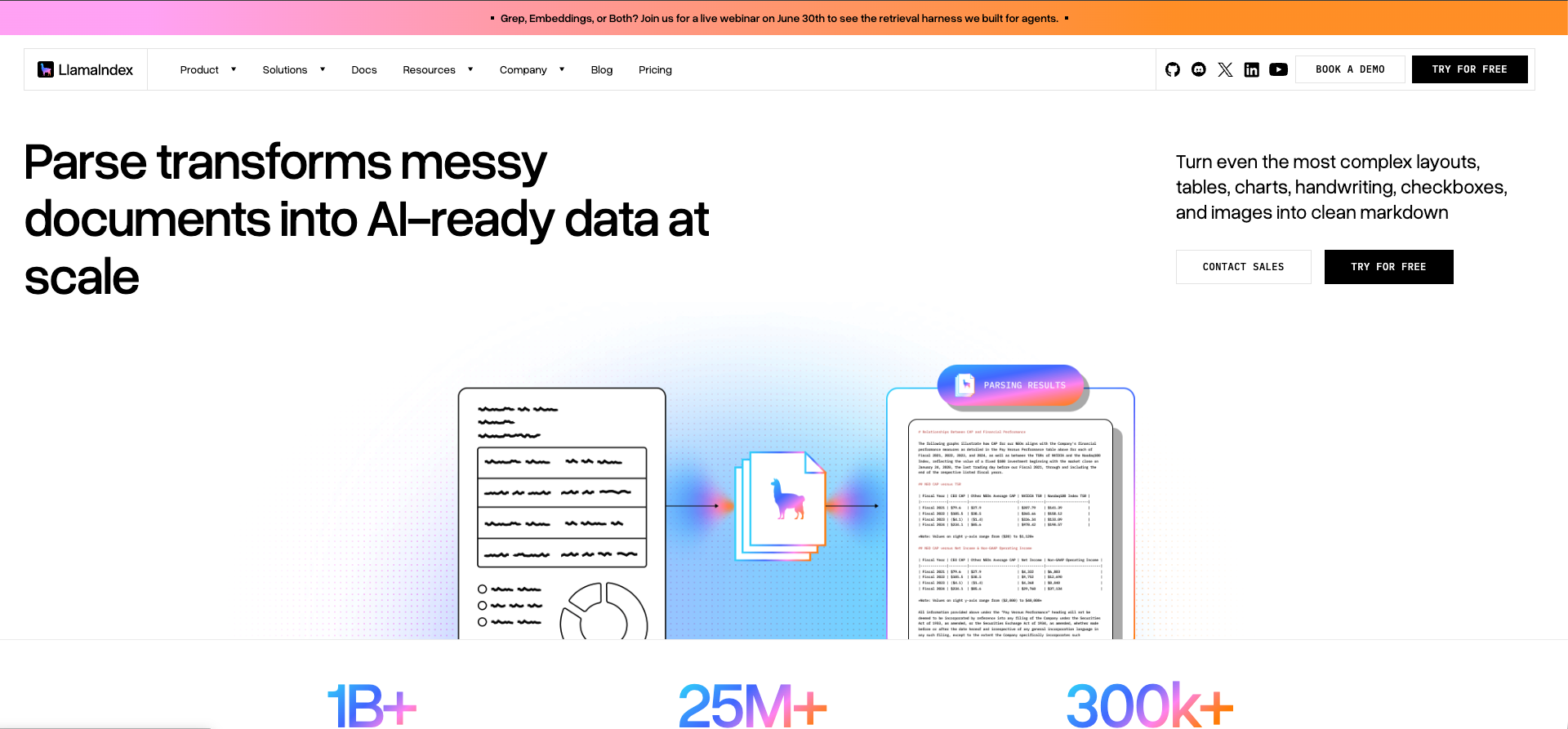
LlamaIndex
Strong developer community credibility but minimal brand investment. Feels like a tool someone built — not a company someone believes in.
Landing.ai
Most established player with Andrew Ng's credibility behind it. But the brand is dense, corporate, and dated — feels like 2019 enterprise software.
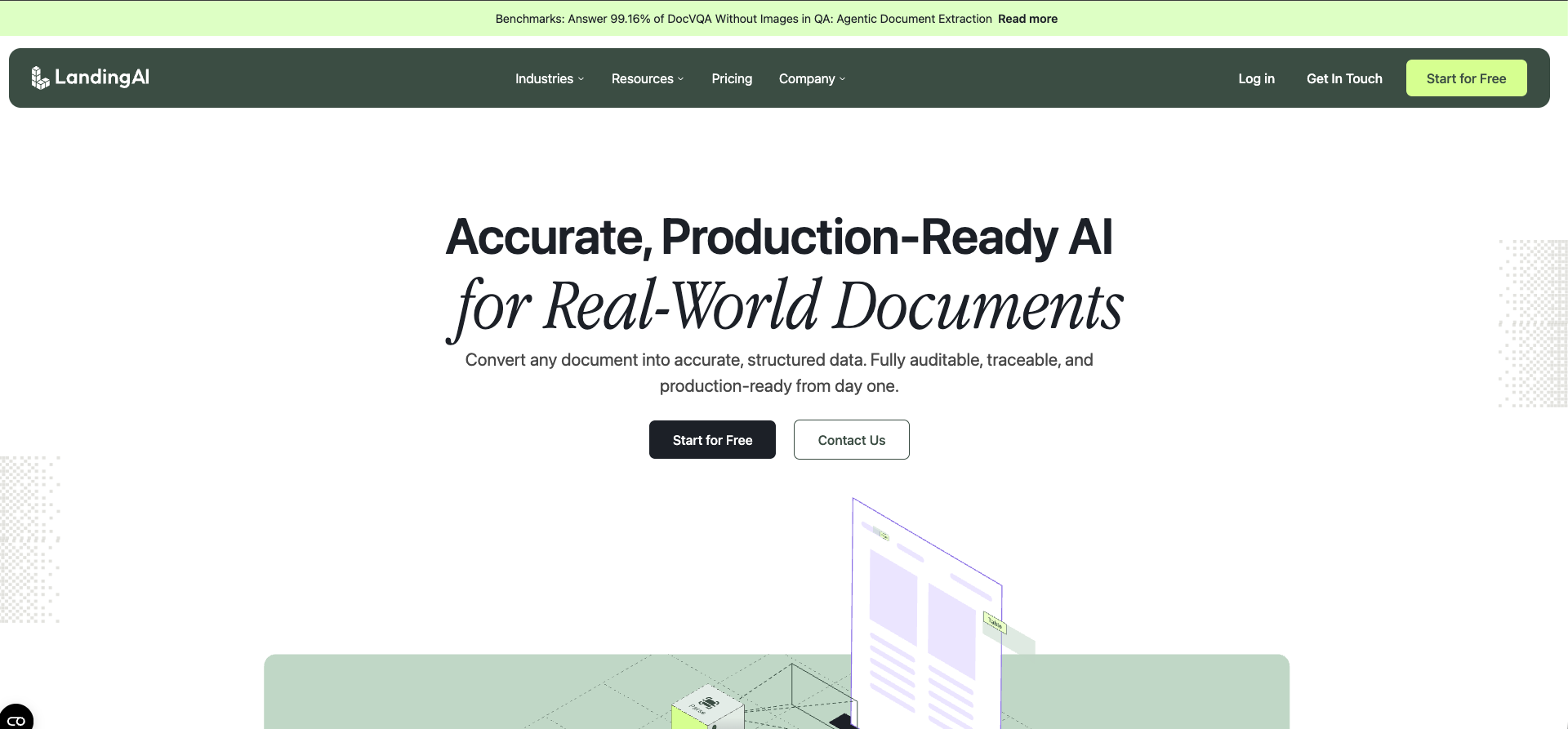
None of them show the product. None of them feel human.
Three Directions
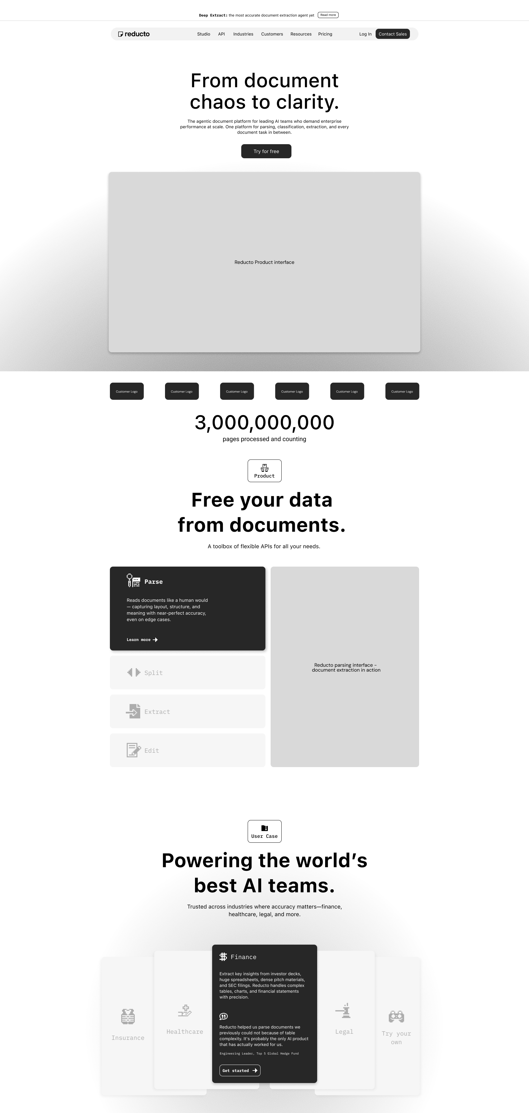
Direction 1 — Pixel Intelligence:
A deeply minimal grayscale foundation paired with pixel art iconography. Documents are black and white — the brand mirrors that world, making the product UI the color moment on the page. The pixel icons reference the old world of paper and filing that the platform is actively replacing. Typefaces: SF Pro Text and IBM Plex Mono — human readable meets machine precise.
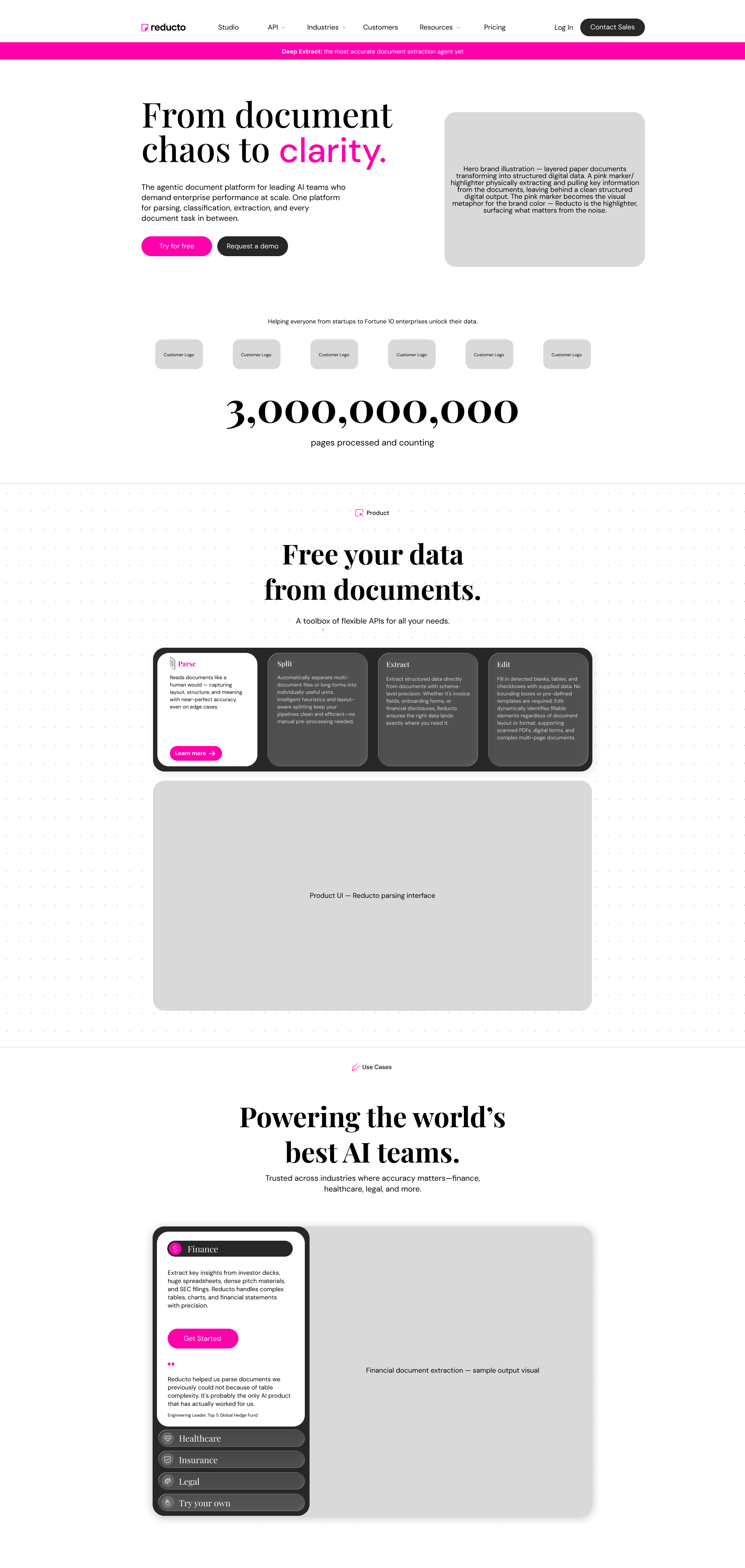
Direction 2 — The Highlighter:
Rooted in the universal human behavior of highlighting physical documents. Pink as the brand color earns its place through that connection — not arbitrary but earned. The pink marker becomes the brand metaphor: the platform is the tool that highlights what matters in your documents. Typefaces: Playfair Display and DM Sans — editorial warmth meets approachable readability.
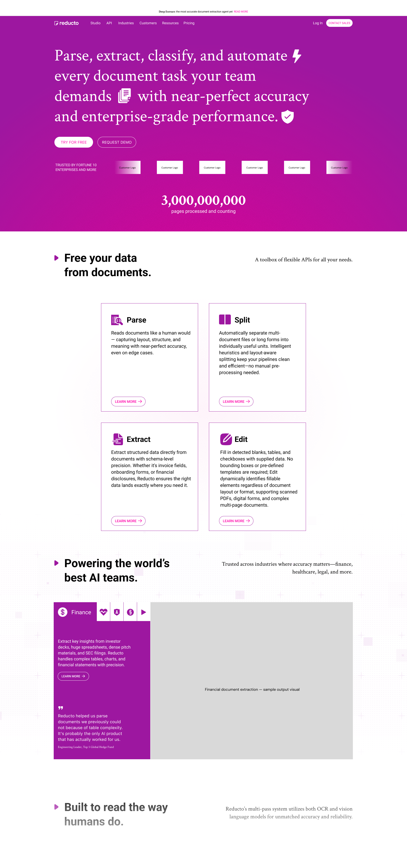
Direction 3 — Purple Elevated:
A question: what if we kept the existing brand color but used it with real conviction? One bold full bleed purple hero, clean white everything below. Drama followed by calm. Inline animated icons within the hero copy add playfulness without compromising the elevated editorial feeling.
Key Design Decisions
Across all three directions I made deliberate choices about what NOT to include — no dark mode as primary treatment, no heavy gradients, no abstract neural network imagery, no generic AI aesthetics. I also prioritized showing the actual product interface early in each page — a principle borrowed from Linear and Notion who integrate their UI into the brand experience so users understand what they're buying within seconds. Copy was rewritten throughout to speak directly to the knowledge worker audience — accountants, operations teams, legal professionals — rather than leading with technical features.
The Result
Three genuinely distinct brand worlds — each one a real proposition for what the visual identity could become. The exercise demonstrated founding designer level thinking: strategic brand positioning, competitive differentiation, typographic systems, and the ability to translate a creative brief into multiple cohesive visual languages.