Brand
Project
A campaign for Greptile built on the most dangerous four letters in software: LGTM.
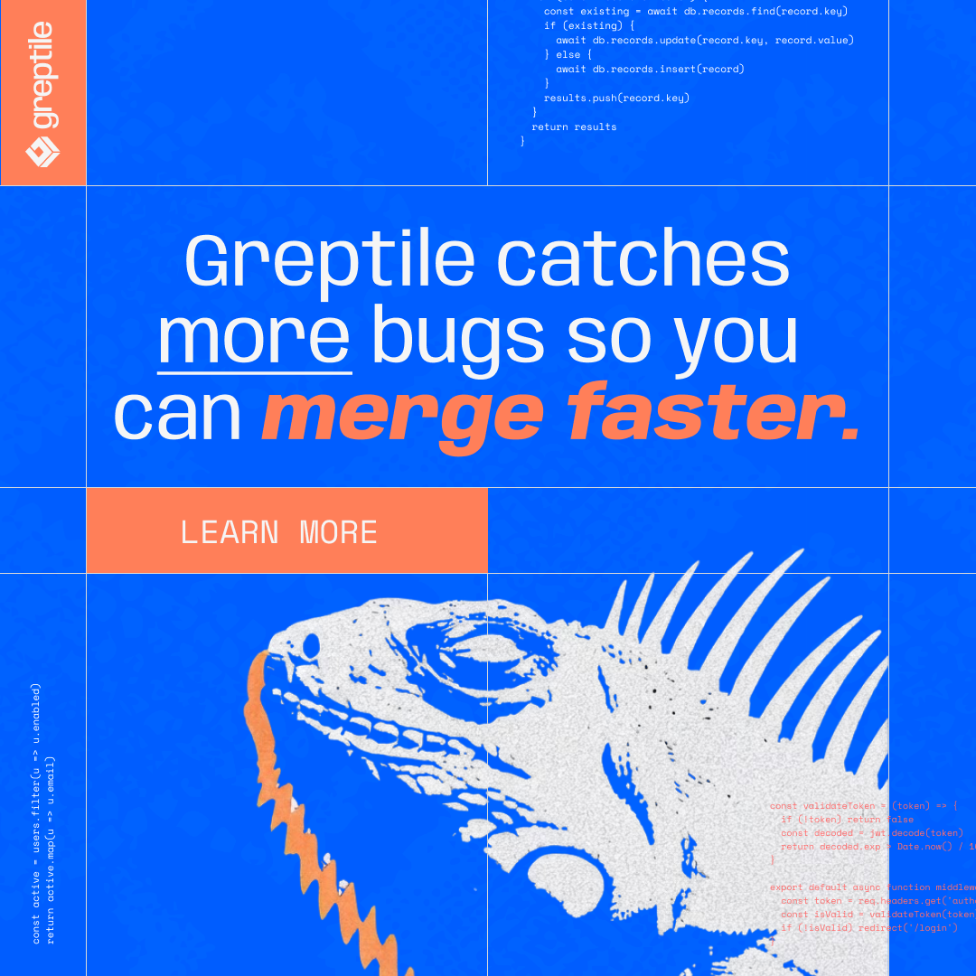
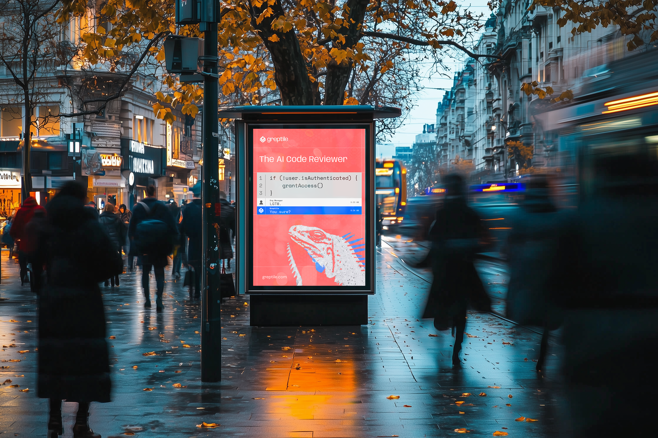
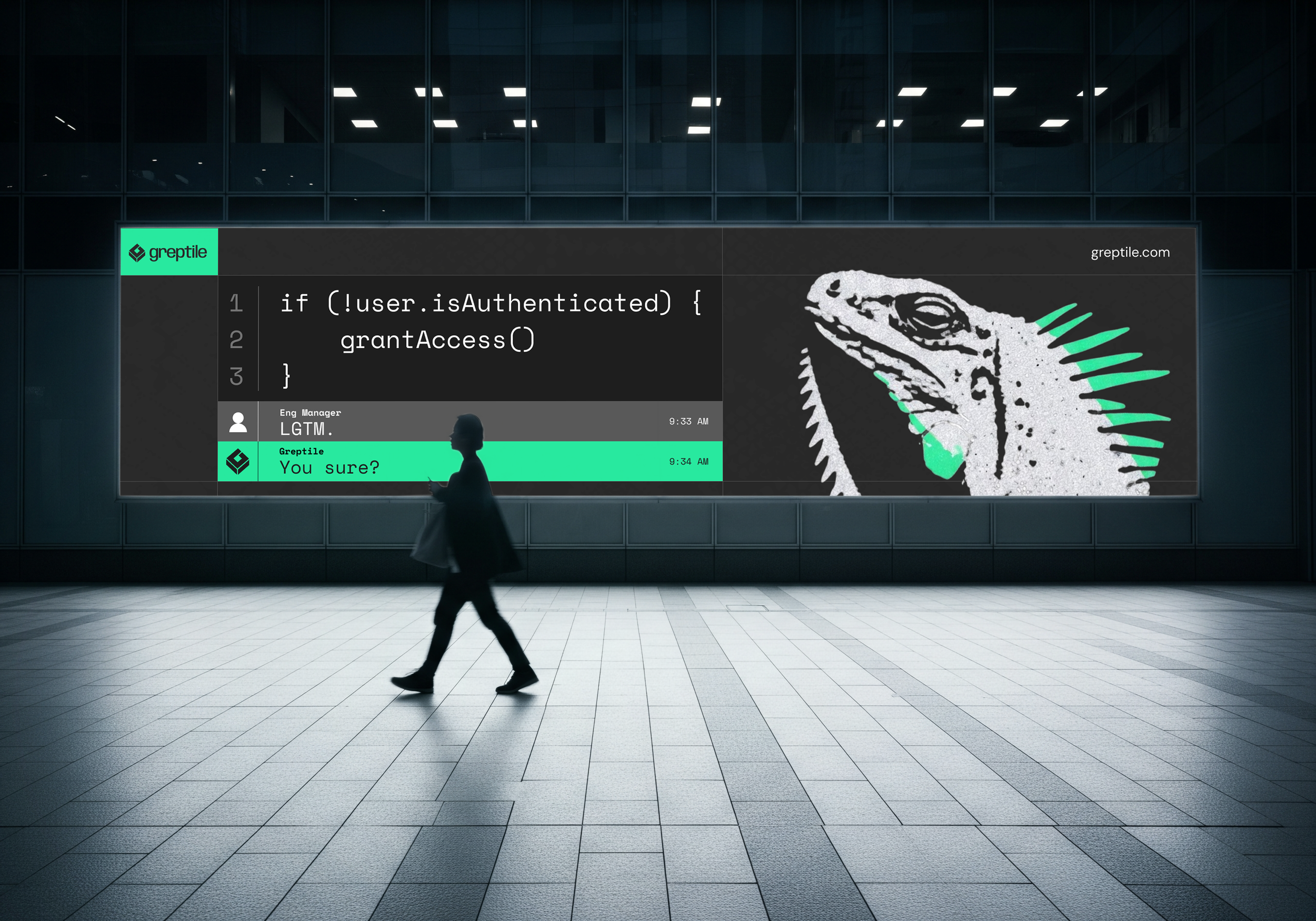
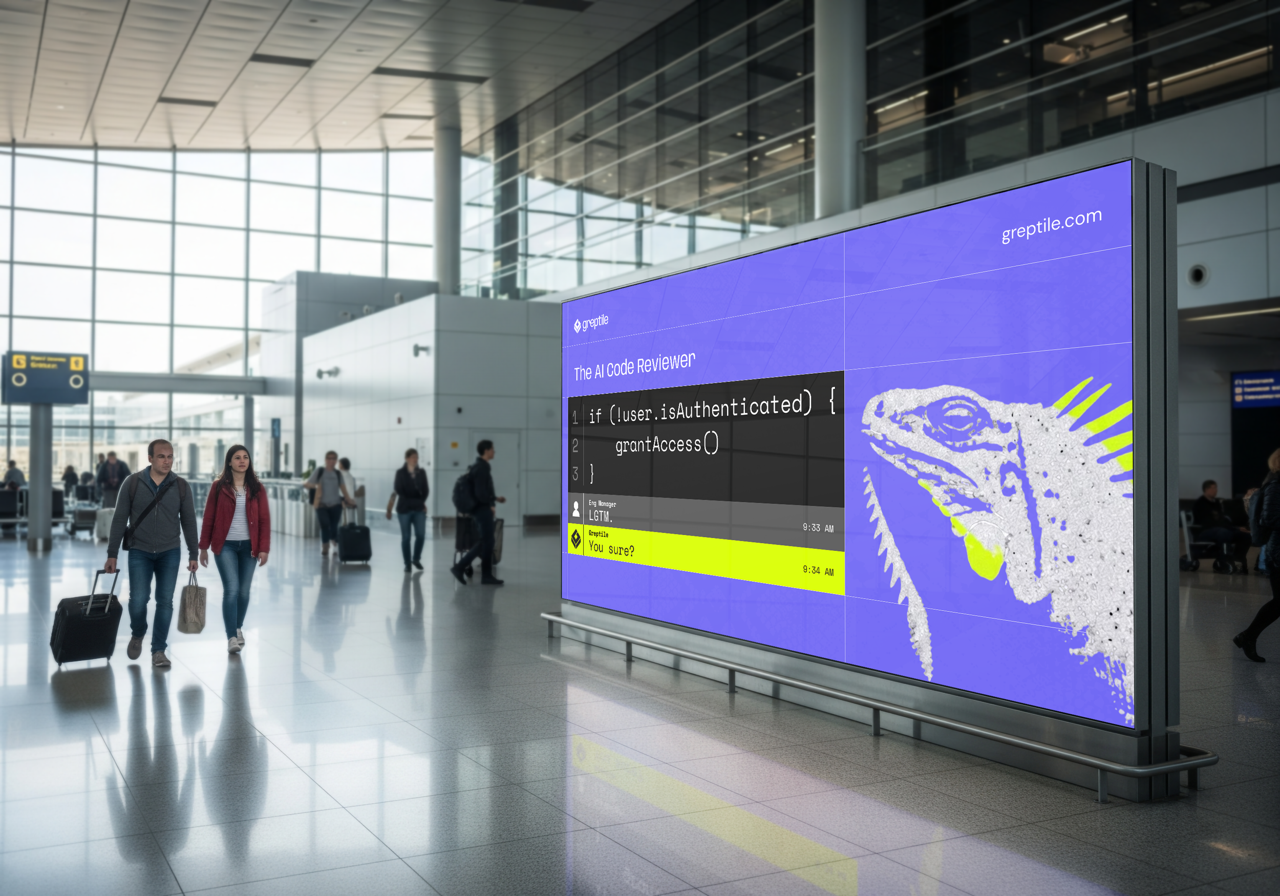
Case study for Greptile developing a campaign direction and extending it into a full brand suite — built on LGTM, the four letters engineers type when they approve a pull request they didn't really read. As AI writes code faster than any team can read it, the danger isn't bad code that looks bad, it's bad code that looks fine. The work uses the product's own format as its layout: real code, a real bug, one careless approval, and a reptile that isn't buying it. Extended across out-of-home, an animated hero, paid social, and merch.
Summary
Tools
Figma, Illustrator, Midjourney
Responsibilities
Campaign Direction, Brand Design
The Problem
Greptile is building the Code Validation Layer — the checkpoint every code change passes through before it ships. AI now generates code faster than any engineering team can read it, which means more software is reaching production unreviewed than at any point in history.
The brand challenge: take that technical infrastructure story and make it something developers feel, share, and remember — without stripping out what makes it technical.
The insight
The document AI category is visually indistinguishable. Every competitor uses the same dark backgrounds, purple gradients, and abstract technical imagery. None of them show the actual product. None of them feel human. The brief called for three genuinely different creative directions — not color variants — that each solved the humanity, paper/digital, and product themes in a distinct way.
The system
Composition
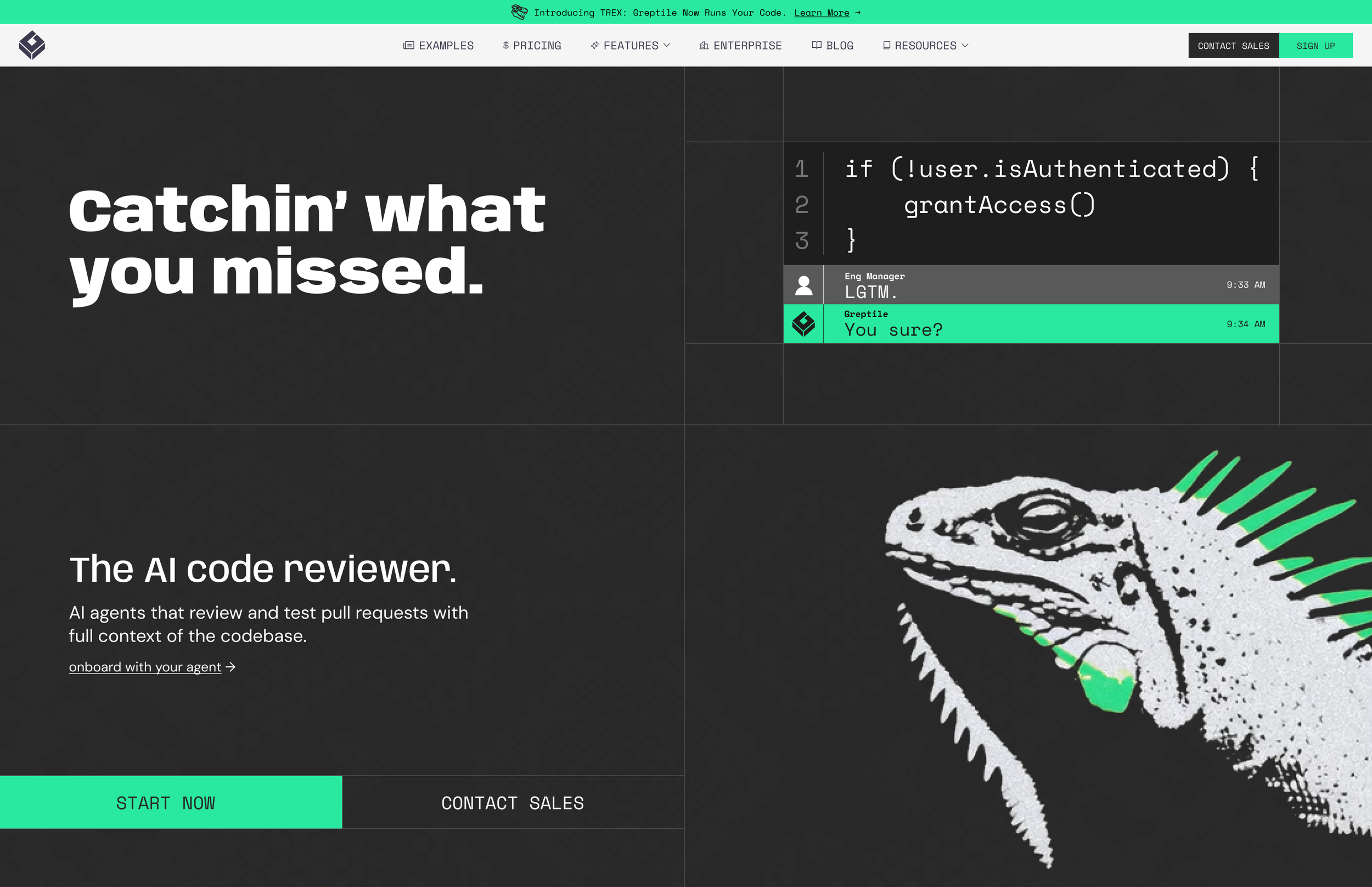
Code is the payload. A comment thread carries the joke. The reptile closes it.
Character
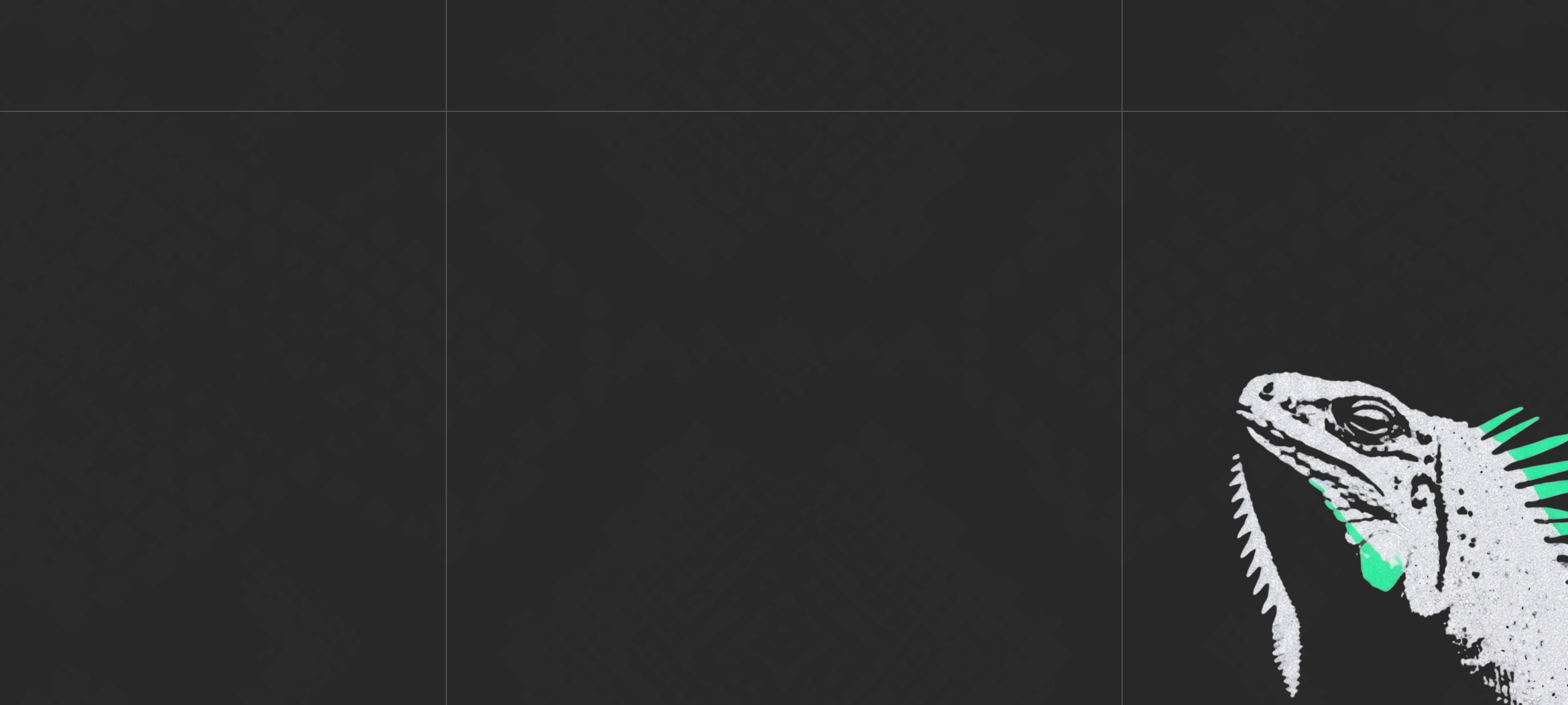
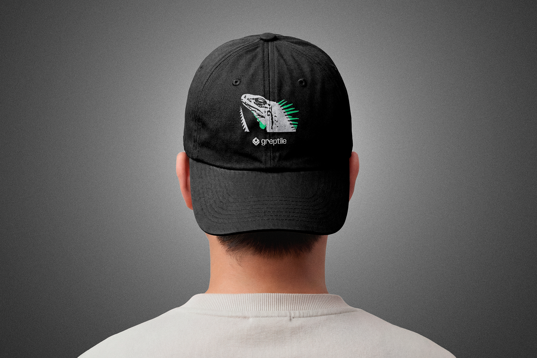
One reptile, one attitude: skeptical, still, already looking. Varied poses, identical treatment. It becomes the recognition device that survives any palette.
Color
Green is Greptile's voice only. The campaign holds up under a color swap because structure and character carry the brand, not the hue.
Typography
Existing stack, pushed. The campaign lives in a code editor; the monospace already carries that world.
Density scales with dwell time
Out-of-home gets one second: one idea, nothing else. Paid social gets thirty: layered code, texture, scale contrast. The landing page carries the full explanation.
The work

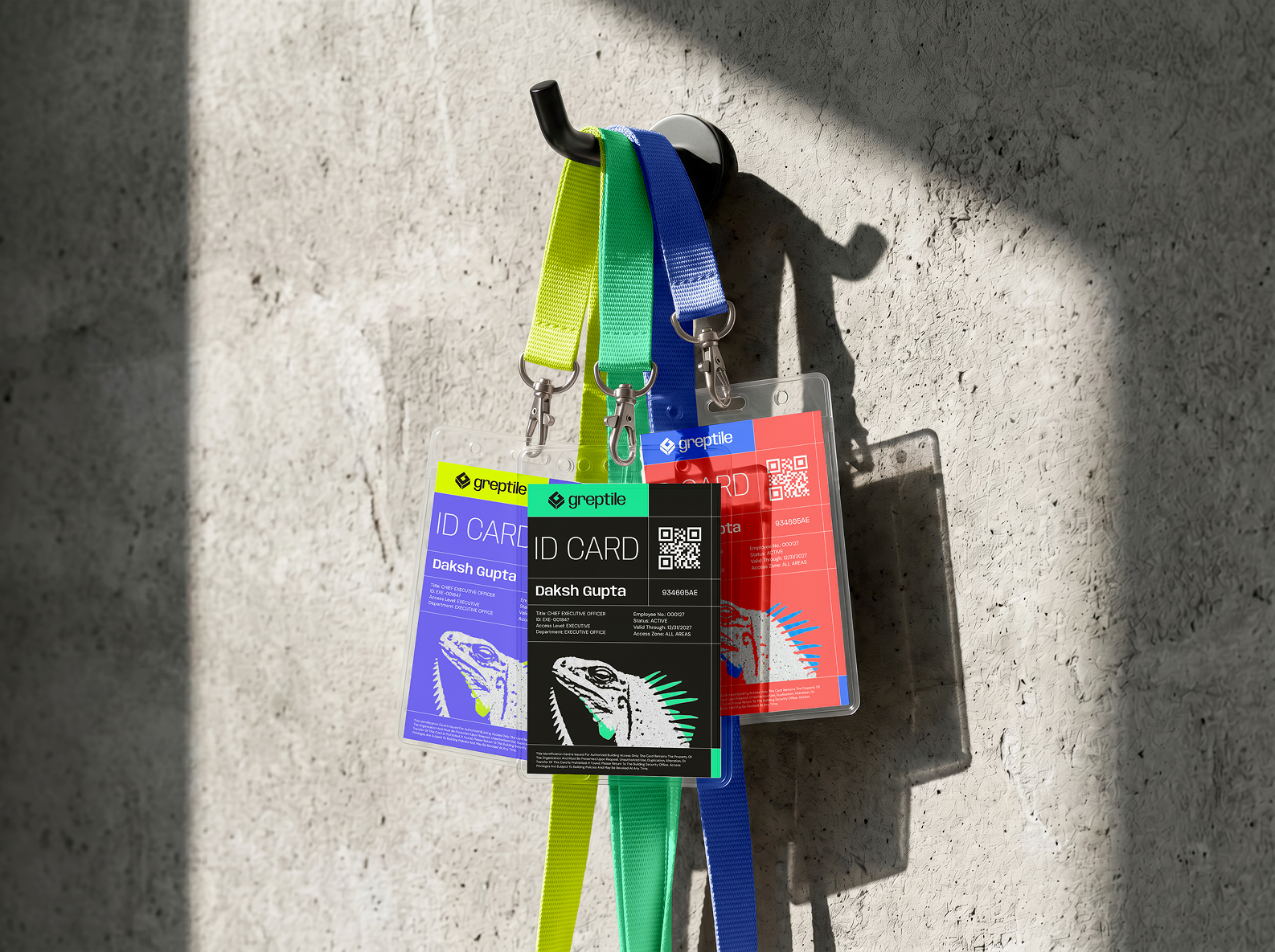
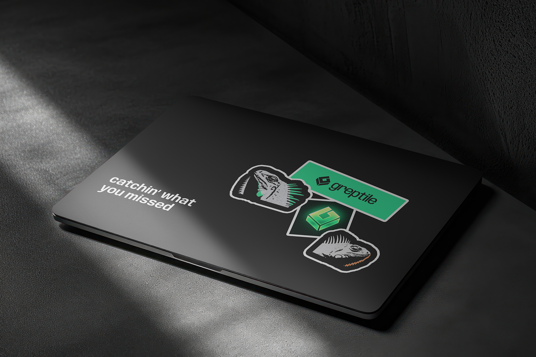
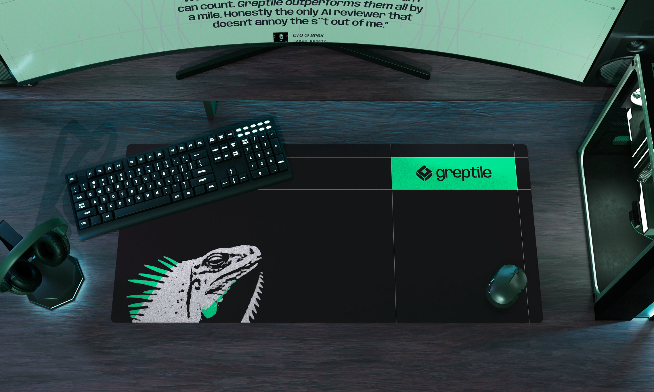
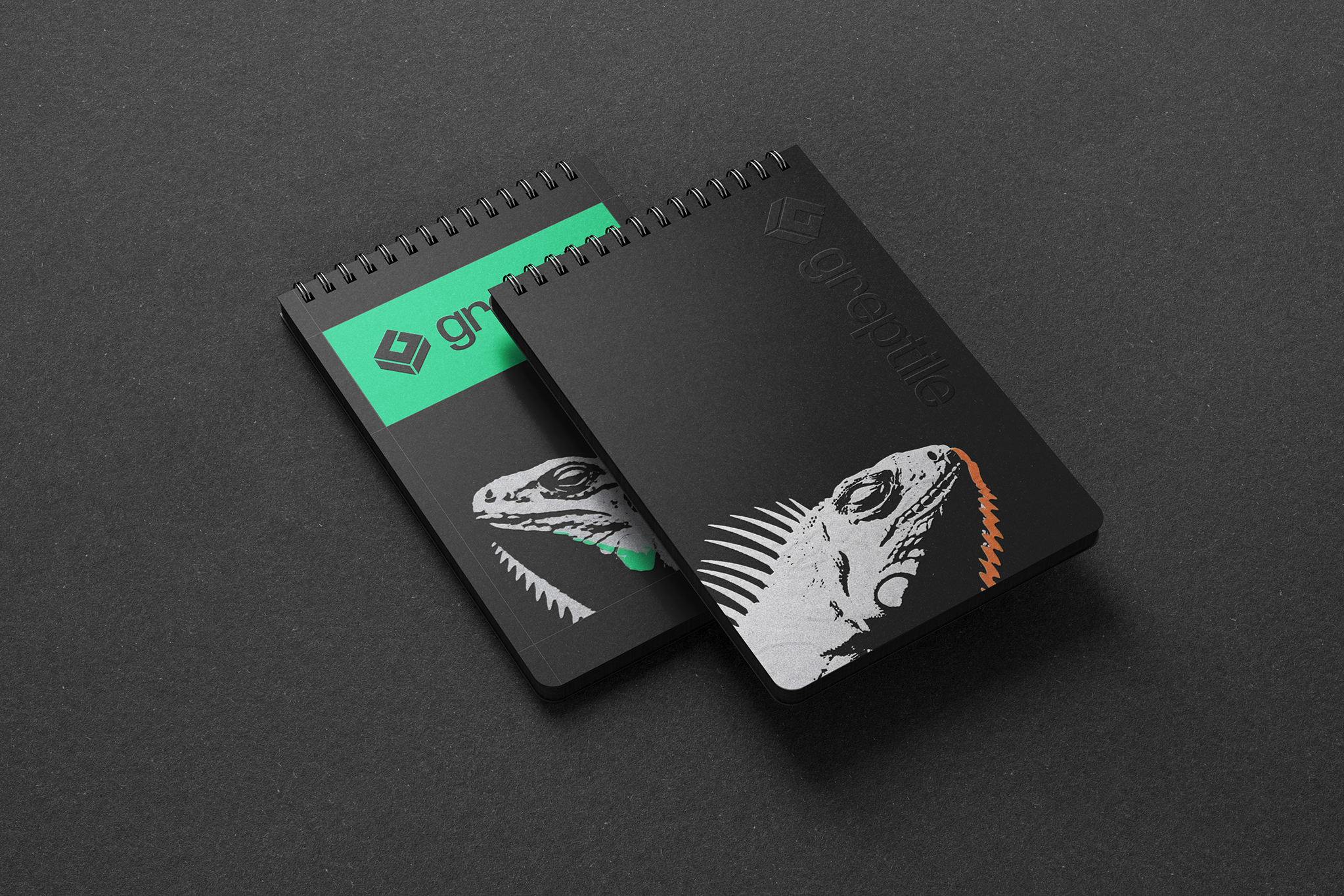
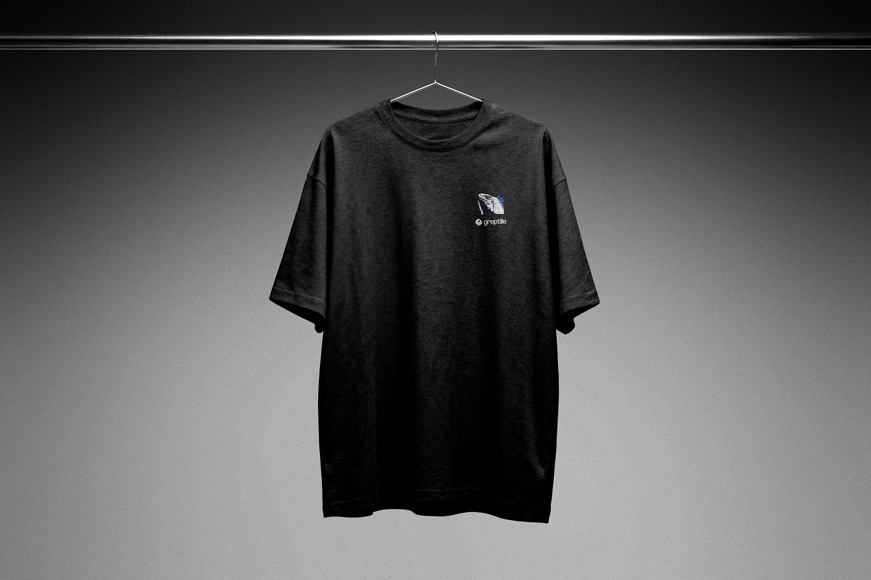
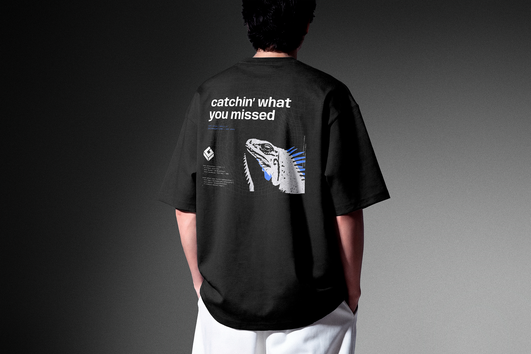
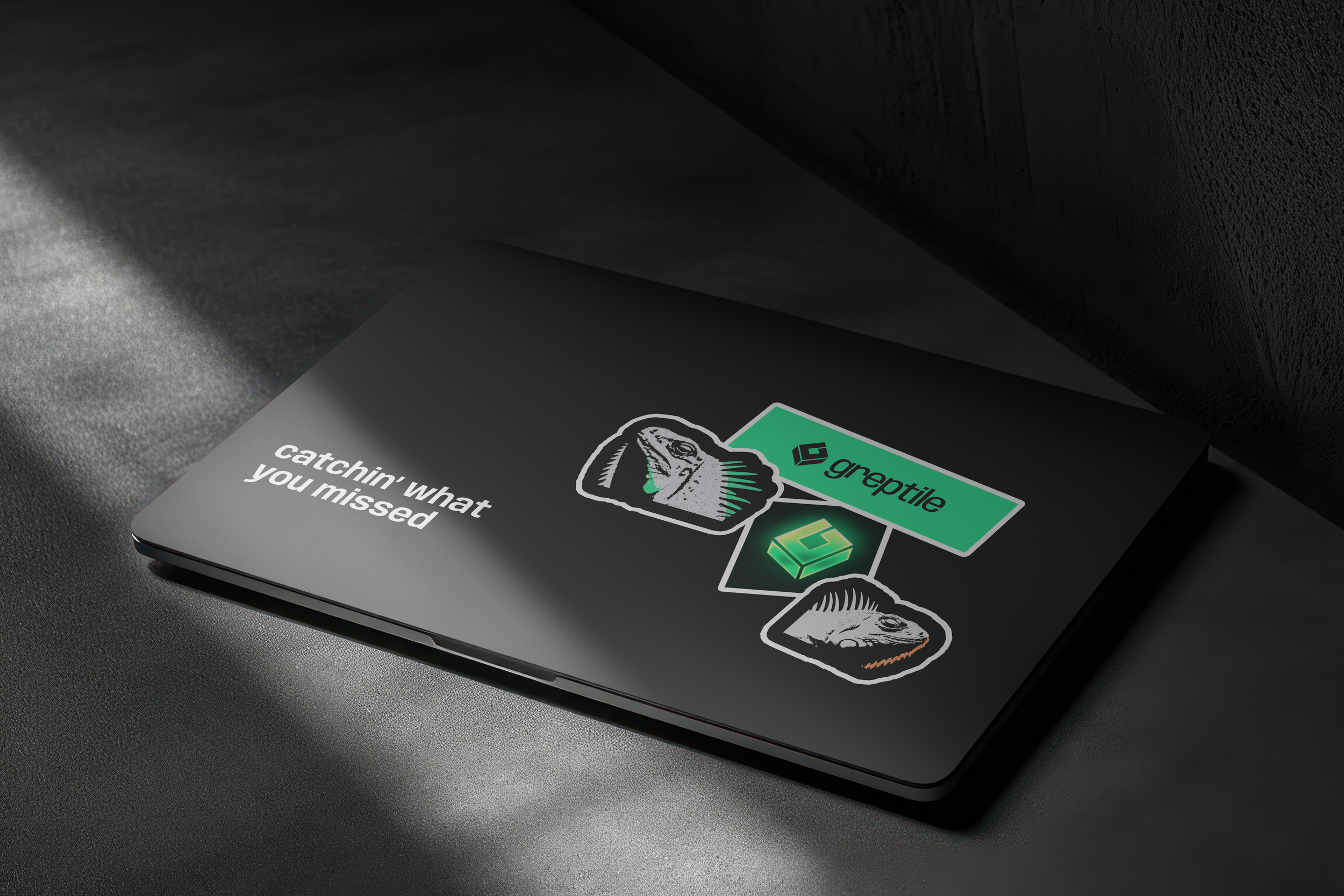
Out-of-home, landing page hero with animated review thread, paid social, and merchandise — one idea expressed across four very different viewing distances.